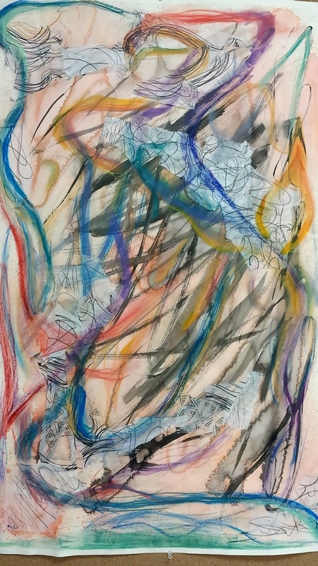
 The theme for this project is to create an abstract piece and learn how to work loosely with my hands as to create a piece that is truly abstract. I tend to spend too much time paying attention to detail and making sure everything is perfect rather than letting my hand go where it pleases, this project really taught me how to take less time perfecting the piece and put more time into learning different mediums and how layer can effect a piece.
The first few layers, the watercolor wash and the ink wash, are supposed to represent how I feel about my dog and how thankful I am to have him in my life. whereas the next layers, the translucent paper, the chalk pastel, and the oil pastel are all representing the people I have in my life whom I am very thankful for. The mediums and layers I used to create this piece all vary and all give a different effect to the piece.The first layer used is light orange watercolor wash, I did about 3 layers of this to add more color and a deeper color in some areas. The second layer I used is ink, which I used in some places as a wash, whereas other places art darker. The third layer I applied is translucent paper, which I drew different images and figures onto, I then ripped the paper and placed the torn pieces in different areas along the paper. The fourth layer is chalk pastel and is used in most areas in the piece. I used darker, cooler colors in this part as to contrast against the orange of the watercolor wash. I also put some red and orange chalk pastel into this layer to bring up the background and create flow of the piece. The fifth and final layer put on is oil pastel. I used this medium to bring out different colors and make them more intense and vibrant. Overall, I feel that the colors work well together and all create the illusion that the piece is moving. My skills have developed throughout this project because I have learned how to let myself go and not care as much about the perfection of my work, I have learned that art is not always making a picture look beautiful but it is about the artist expressing themselves through their work. I also have a better understanding of the mediums I used and the effect they can have on an art piece. I feel that I have done well with expressing myself through the piece and creating an effect that would make the viewers eyes follow throughout the piece. I feel that i can improve on the blending of each color and making them flow a bit better. I used formal elements in this piece that include, line, color, tone and shape. I used line in almost every medium I used, thus creating the effect of movement. I also used color in this piece to highlight and darken areas I felt needed to be. The materials I used were all very successful and i enjoyed working with them and learning more about the effect they give. I feel that the message and meaning I wanted to convey throughout this piece is that I wanted to represent everything and everyone I was thankful for in my life, I do feel that I was successful in conveying this message. Overall, I am happy with my final piece and I had lots of fun working with the different materiel. I hope to go further into exploring these materials and improving my work.
0 Comments
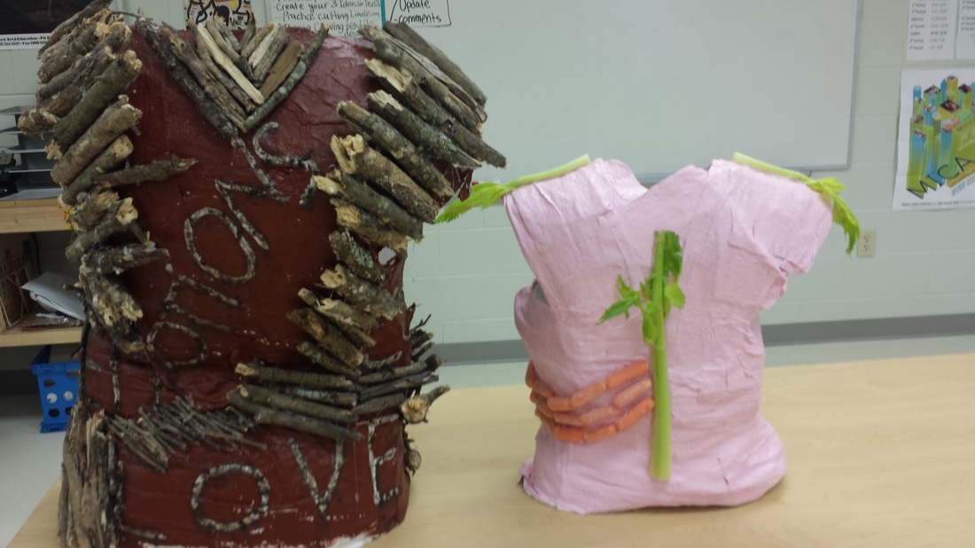 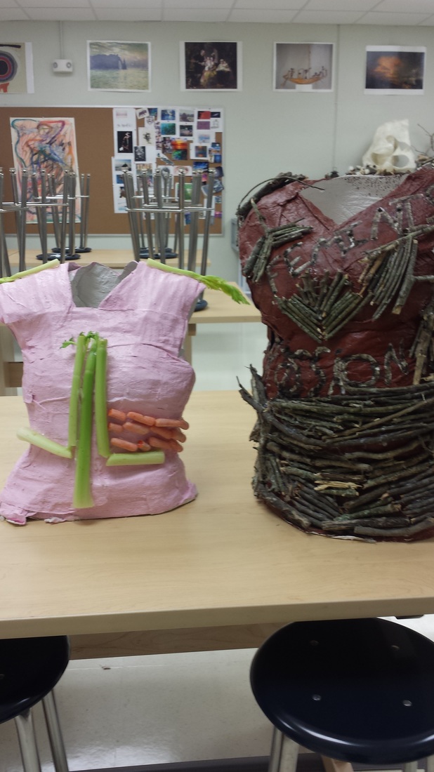 This series is representing how society views woman and how society thinks we should act. The piece with the brown paint, wooden sticks,and moss paste represent the hard and soft parts of a women. The pink structure with the carrots and celery represents how society thinks women should look and act.
the jealous curator-Sophia Heymans, "prairie burn". when I first look at the piece I notice lots of vivid colors in the series as well as texture. I notice nature is a main theme throughout the series. I also notice that there are many details within the pictures. I see bold, vivid colors that are carried out through the series. the shapes in the pictures are soft and rounded. I also notice that most of the lines are rounded as well. The textures that i see reflect the images. Sophia Heymans says that she added acrylic paint, moss, paper mache, string, twine, prairie grass seeds, dried dill, and oil on canvas. She uses these materials to add texture and to reflect the images themselves. the overall effects of this series is very romanticized and beautiful, showing the true beauty of nature. the artists used colors in this series by exaggerating them to add to the effect of the overall piece she used shading to show shadows and depth. the colors used in this piece are vibrant and vivid. these bold colors give the piece an exaggerated effect, the shapes used are soft and rounded rather than sharp and exact, this gives the effect of exaggeration. the textures used are materials found in nature, such as the moss and prairie grass seed. I feel that this is a great way to incorporate nature in a painting with a main theme of nature. light is used in places shadow isn't. i think the artist did a really nice job using color value and not having too drastic of a change when going from light to dark or dark to light. this piece has an overall happy and lucid element this element is achieved by using vibrant colors and soft shapes that are seen in this piece. i feel that the artists statement in this series is to show how beautiful and undisturbed nature is, even through the changing of seasons. to me, this series represents the peacefulness and tranquility of nature, also how seasons change, just like every aspect of life. even though changing situations can often cause chaos, i feel that this piece shows that change brings even more beauty than before. this can relate to my life because although change is scary it is also necessary and can bring many great experiences if one's mind is open to it.    |
|
 RSS Feed
