|
The theme for my project is mental disorders. I wanted to depict the struggles that I go through daily. The separate pieces all depict a disorder starting with depression, then anxiety, and finally addiction. These pieces all come together to make a final series. My ideas have mainly developed through my experiences but also by looking at other artist’s work who have done similar pieces to mine. These artists include: Andrea Castro, whose paints and various layers inspired my pieces, and Daisy Patton, whose soft colors and faces inspire the softer tones in my piece. Most of the artists that I chose to use as references use photo transfer and multiple layer of color to create dimension and to emphasis the piece more. My skills have developed throughout this project by learning more about photo transfer, as well as being able to build up different layers and create a conversation with the viewer. I learned varies ways to manipulate the piece to create the effect I want it to have, such as scratching into wet paint to give the effect of an overwhelming sense in my anxiety piece. In addition, I learned how to apply the paint in a way that will continue the flow of the rest of the piece, such as in my depression piece I made the paint look cloudy and faded out to show how depression makes me feel. I think my overall project is done well and starts a conversation with the viewer about different mental disorders. I think I did well with applying the photo transfers in an aesthetically pleasing way. I could improve on making the paints give the same effect as the photo transfers. Formal elements were used in all of my pieces including line, tone, color, and shape. I used line to create either a very jagged line or a soft faded line. In my anxiety piece I used a sharp line to show the jaggedness of the disorder. I used tone to create the effect and the mood that I wanted to show through my piece. Color was used when representing the disorder and the color that I often associate with that illness. Lastly, shape was used to create either a sharp effect or a softer effect. I used photo transfer, paint, and water color to create my pieces. I used water color as my first layer then went on to add photo transfer, and finally I applied paint, these materials did work successfully. The overall meaning I wanted to convey throughout this project was mental disorders and I how I view the few that I struggle with. I find that through applying the correct colors and line I am able to convey the message that I wish to achieve. I feel that I was successful in conveying this message. I am happy with my final piece and feel that it is successful. 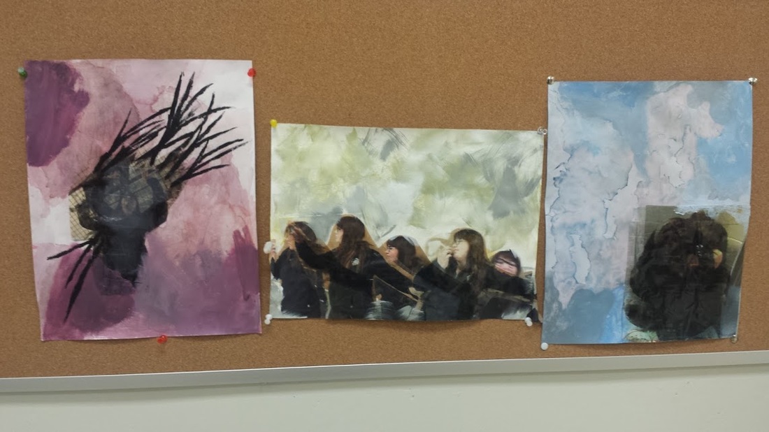
2 Comments
This is the second piece in my mental disorder project. I photo transferred the pictures in this piece as well. I wanted to show the overwhelming sense that anxiety gives me through the colors and and layered pictures. The background has watercolor and acrylic paint. I scratched into the surface of the background to give the effect that anxiety gives me. I also put black paint on the corners of the transfers coming off of them and onto the red area, I did this because this shows how anxiety makes me feel. I choose red/purple for the background because these colors remind me of what it feels like to be anxious. I am currently working on my next piece which is addiction.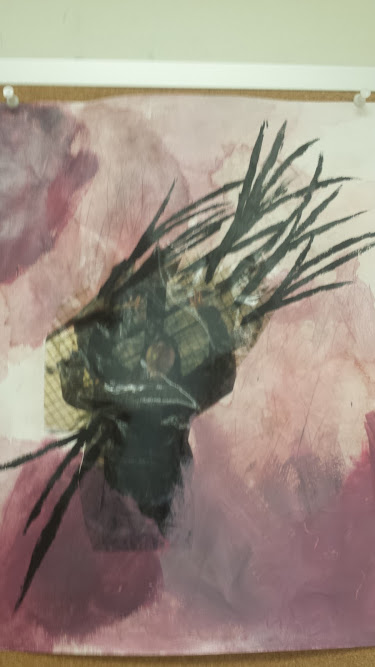 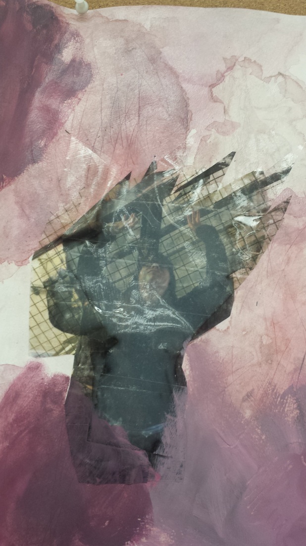 This series is about mental disorders and how I feel and relate to them. The first piece in the series is depression, which I personally struggle with. I wanted to create a series that shows how thesw disorders feel to me and in my experience what they are like. I am currently working on the second piece in the series which is anxiety. 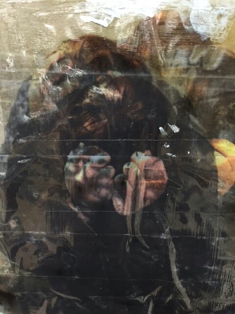 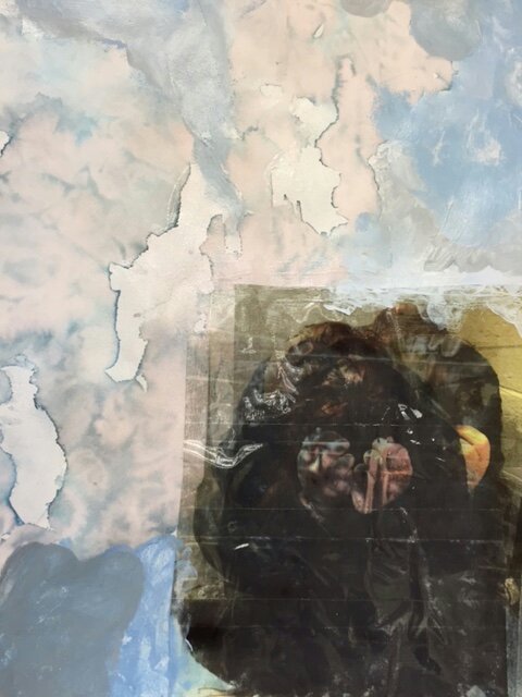 Overall, the commentary I recieved for my feminist sculptures is positive. I thought people were going to be a bit more rude, as the piece doesn't fit in with social norms, but is still a very important conversation to have. I am glad people enjoyed my sculptures and I hope I was able to make them think harder about the subject. 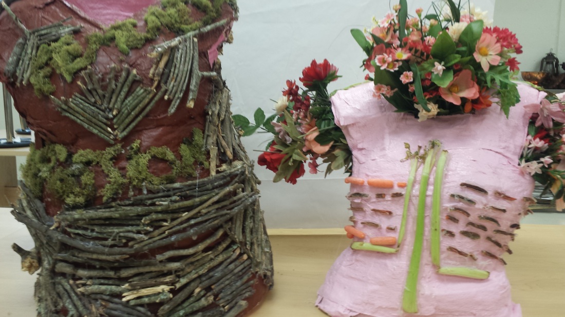 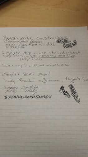 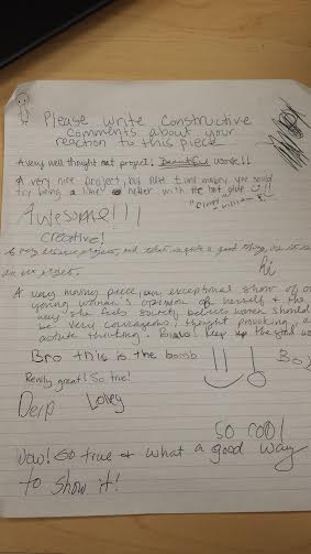 These sketches were done in Raleigh, NC, and are all from observation. I played around with the use of watercolor in the sketch that overlooks the city. The watercolor gives the piece dimension and a sense of realness. I enjoyed using the watercolors, as it is a great way to practice layering techniques. The sketches of the boy and the table are also from observation. They were done in a coffee shop. The little boy was sitting in a chair near by and I was able to capture his figure but he left before I could draw details. I very much enjoyed urban sketching and I think its a great way to learn how to capture the moment. 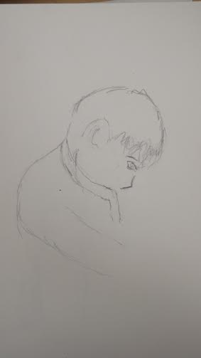 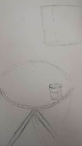 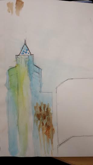 I feel that I have grown significantly and artistically this semester. I have learned to use many more mediums through the projects I have made. I am more comfortable to open up and let my emotions be expressed through my art. I think that my strongest project is my feminist sculpture project. I was able to express my feelings as well as start a conversation with the viewer, this is my hope for my art, that each piece will create dialogue and deep thought for whoever is looking at it. I hope to explore more of my passion for art and continue to make new and creative pieces.
 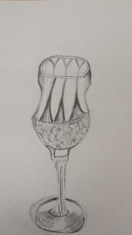 These are drawn from observation from glass and metal objects. I used shading and pencil weights to show shadow and roundness in the pieces. I learned how to shade with different weights to give different effects and make the piece look like its coming off of the paper.
  This project is representing the way society views the female body as well as how femininity is shown throughout society and is typically looked down upon. This project also represents the differences between how society thinks women should look and act versus how woman actually look and act.
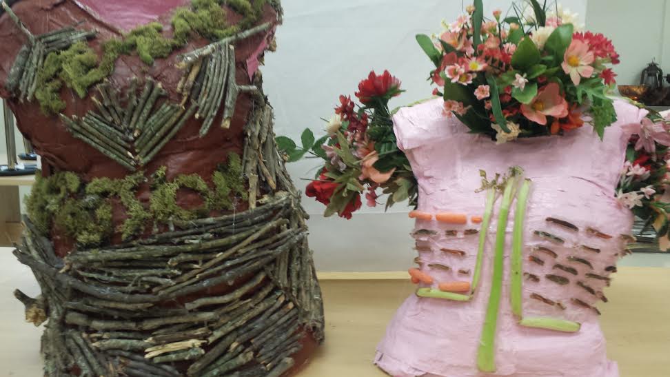
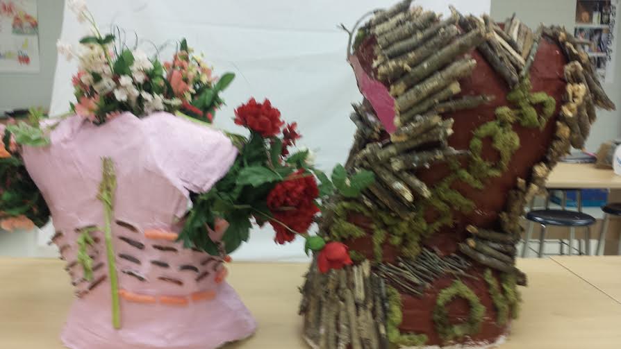
The figure painted brown with sticks and moss is a mold of my upper body. This model was made by putting cloth plaster over the upper part of my body and waiting for the plaster to mold to my figure and dry. I then cut the plaster off of my body and waited for the it to dry completely. Once the plaster was dry I painted a coat of brown then outlined where the moss graffiti would go. I collected sticks to place over the figure where the moss wouldn't go. I placed the sticks in a way that seems they are forming armor, this is included in my theme because I want to show that femininity is often seen as a weakness when in reality it actually shows strength and protection for many women. The moss graffiti was originally homemade and painted on, sadly the moss didn't grow much so I went to the art store and bought some moss to place over the words. The words in the front say feminist and compassion, the words in the back say love and kindness. These are all descriptive words that represent strengths that are looked down upon in society as weaknesses. These words also play a major role in the theme of this project. The inside of the figure is painted pink to show femininity on the inside, seen as a softness but is actually a strength. This figure is representing the realness and naturalness of the women body. The figure painted pink is my friends upper body, she is smaller and I thought she would be a great model for the second figure. The figure represents the "typical" girl that society accepts. The model of dried plaster was painted pink to show the color of femininity, and pink being the typical color for girls that society thinks is acceptable. I then placed celery on the figure to outline where the spine and middle part of the figure is. I used carrots to show the outlining ribs, and the thinness of the figure. I used carrots and celery to represent that girls are often told to eat little to nothing and to only eat things that will keep them pretty and thin. As time goes on the vegetables rot and turn bad. They lose their nutrition and pureness, much like the women body who has been told what to eat and is often shamed for wanting to eat more. The fake flowers on the figure represent fake beauty and emptiness. The flowers themselves are beautiful but they are fake and cannot grow or become better, much like the way society says women should be. Overall, I am very happy with my final piece. I feel that this project is one of my strongest and I enjoyed working on it. 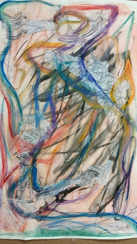 The theme for this project is to create an abstract piece and learn how to work loosely with my hands as to create a piece that is truly abstract. I tend to spend too much time paying attention to detail and making sure everything is perfect rather than letting my hand go where it pleases, this project really taught me how to take less time perfecting the piece and put more time into learning different mediums and how layer can effect a piece.
The first few layers, the watercolor wash and the ink wash, are supposed to represent how I feel about my dog and how thankful I am to have him in my life. whereas the next layers, the translucent paper, the chalk pastel, and the oil pastel are all representing the people I have in my life whom I am very thankful for. The mediums and layers I used to create this piece all vary and all give a different effect to the piece.The first layer used is light orange watercolor wash, I did about 3 layers of this to add more color and a deeper color in some areas. The second layer I used is ink, which I used in some places as a wash, whereas other places art darker. The third layer I applied is translucent paper, which I drew different images and figures onto, I then ripped the paper and placed the torn pieces in different areas along the paper. The fourth layer is chalk pastel and is used in most areas in the piece. I used darker, cooler colors in this part as to contrast against the orange of the watercolor wash. I also put some red and orange chalk pastel into this layer to bring up the background and create flow of the piece. The fifth and final layer put on is oil pastel. I used this medium to bring out different colors and make them more intense and vibrant. Overall, I feel that the colors work well together and all create the illusion that the piece is moving. My skills have developed throughout this project because I have learned how to let myself go and not care as much about the perfection of my work, I have learned that art is not always making a picture look beautiful but it is about the artist expressing themselves through their work. I also have a better understanding of the mediums I used and the effect they can have on an art piece. I feel that I have done well with expressing myself through the piece and creating an effect that would make the viewers eyes follow throughout the piece. I feel that i can improve on the blending of each color and making them flow a bit better. I used formal elements in this piece that include, line, color, tone and shape. I used line in almost every medium I used, thus creating the effect of movement. I also used color in this piece to highlight and darken areas I felt needed to be. The materials I used were all very successful and i enjoyed working with them and learning more about the effect they give. I feel that the message and meaning I wanted to convey throughout this piece is that I wanted to represent everything and everyone I was thankful for in my life, I do feel that I was successful in conveying this message. Overall, I am happy with my final piece and I had lots of fun working with the different materiel. I hope to go further into exploring these materials and improving my work. 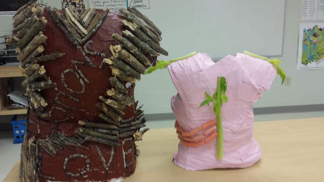 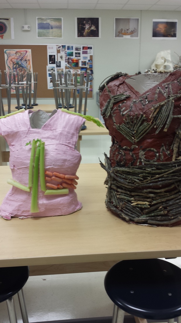 This series is representing how society views woman and how society thinks we should act. The piece with the brown paint, wooden sticks,and moss paste represent the hard and soft parts of a women. The pink structure with the carrots and celery represents how society thinks women should look and act.
|
|
 RSS Feed
